Project Overview:
A proprietary analytics tool for digital marketers providing insight on a brand’s competitive landscape was in need of a major redesign. In the previous application, a single page served two use cases: the ability to discover new competitors and the ability to manage competitor groups. However, in the redesign, we decided to separate them since each page had its own function.
After launch, we received user feedback stating it took too many clicks to "discover" a new competitor. Also, adding them to a new or existing competitor group required navigating to a different page.
My Role:
For this project, I led both the user research and design. The initial user feedback was received via email and therefore I had to first determine if this was a specific user issue or global-wide usability problem. After interviewing power users in North America, EMEA, APAC & LATAM, it was determined this was a global-wide problem and needed quick resolution.
The Challenge:
The challenge was to combine the two pages onto one page and support the two different use cases. The two objectives being; the ability to discover new competitors and manage competitor groups.
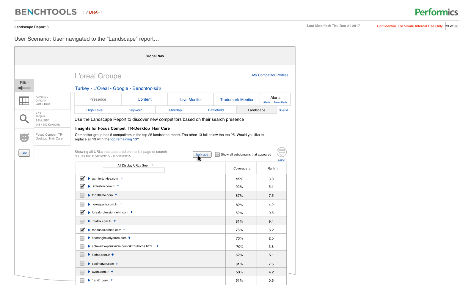
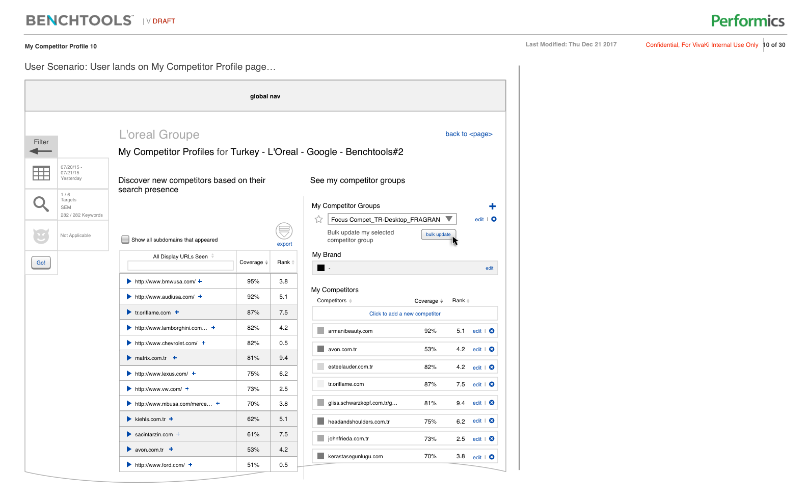
The Initial Designs (the problem):
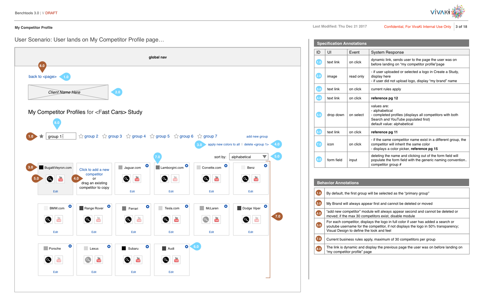
Competitor Group page, editing and adding new competitors, prior to the redesign
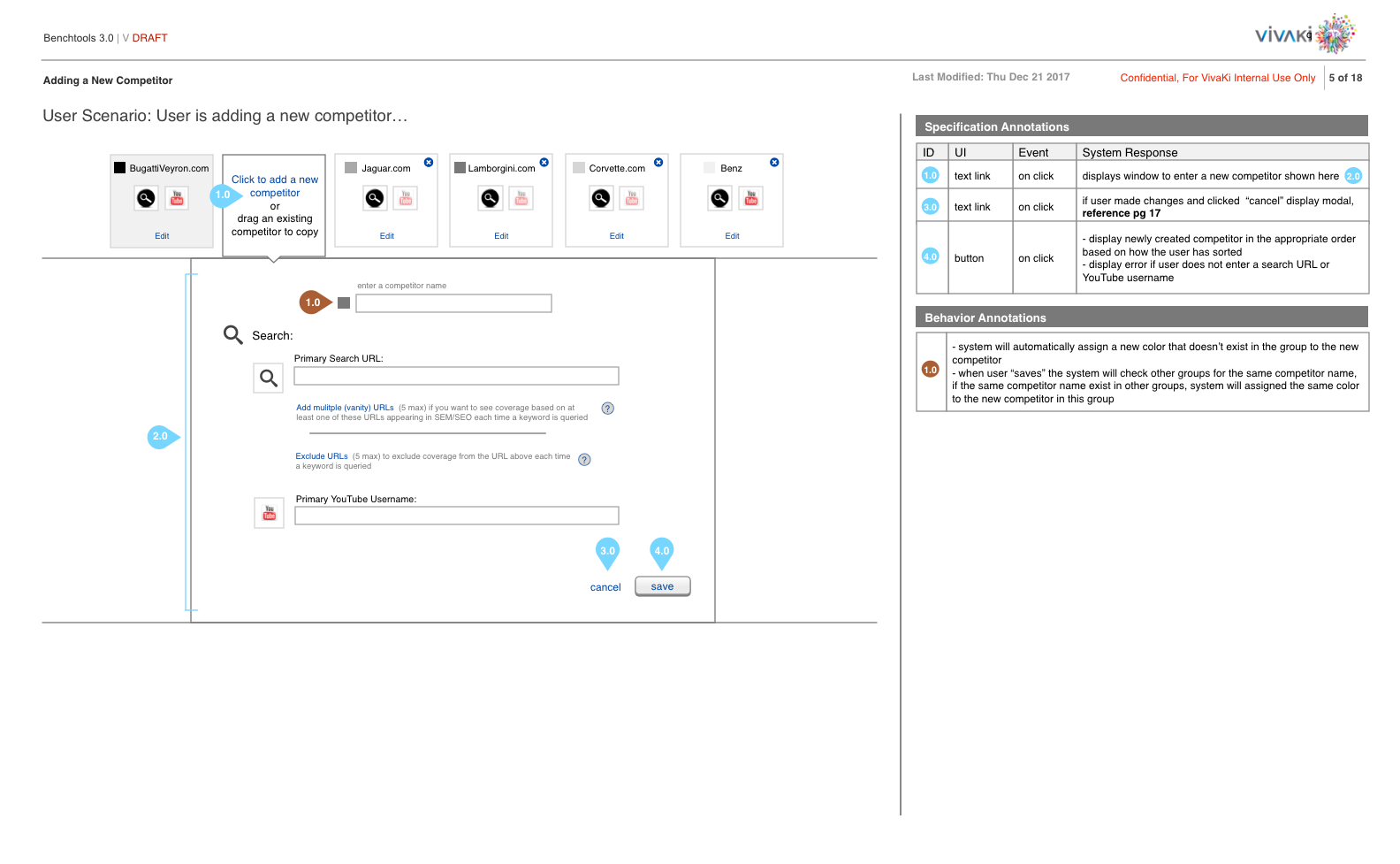
Competitor Group interaction
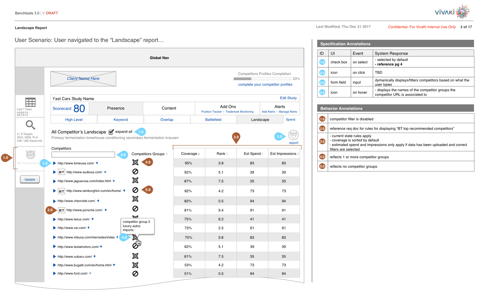
The Landscape Report, where a user discovers new competitors
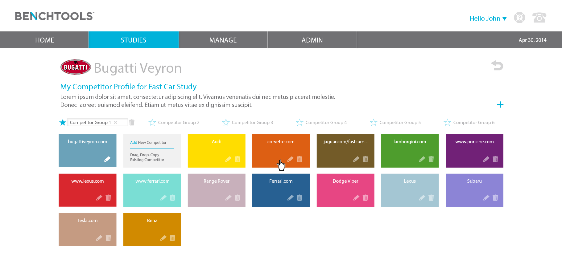
Visual design of Competitor Group page
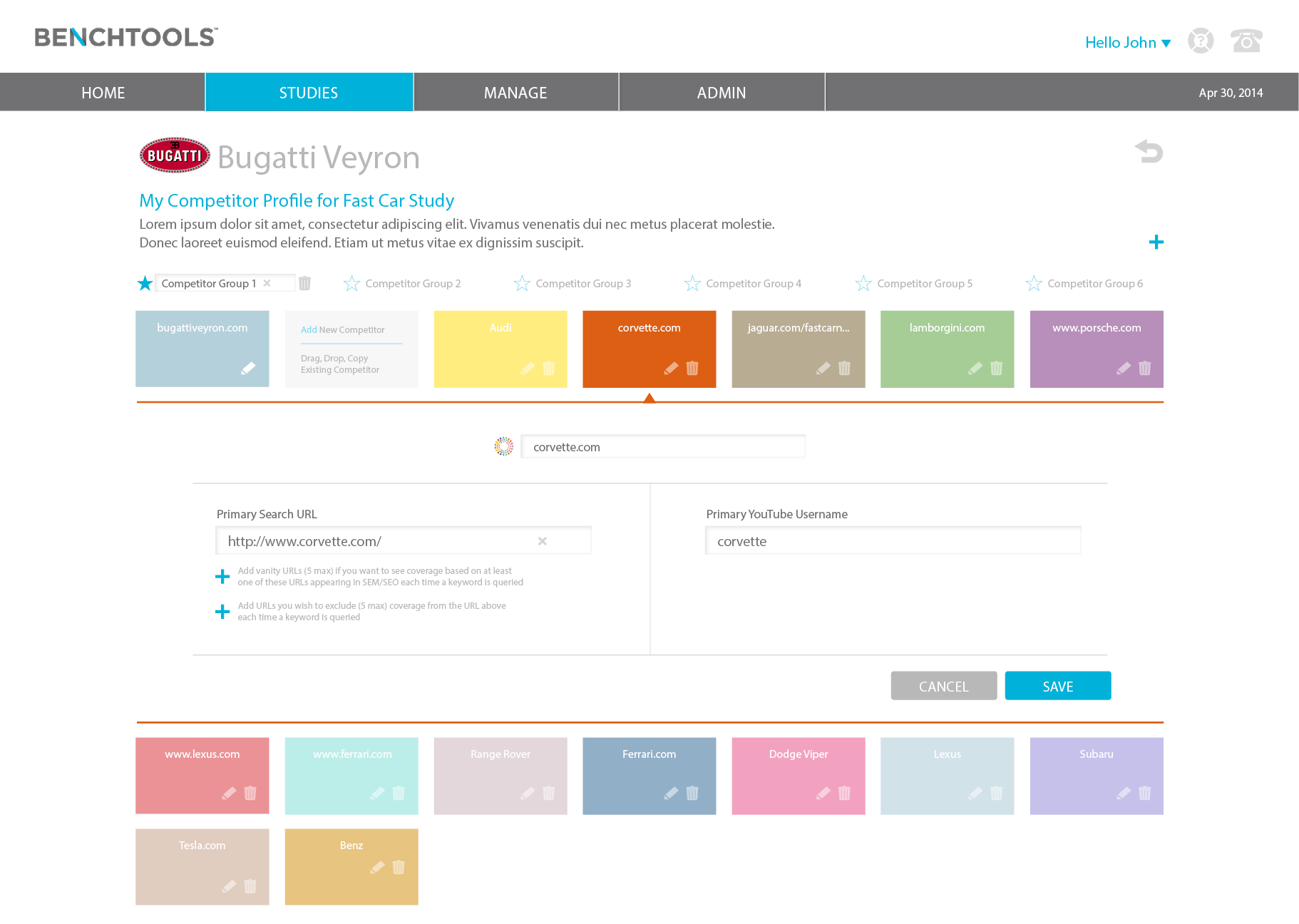
Competitor Group interaction
The Approach:
After conducting user interviews, I had enough feedback to design a solution. I presented to the Product Team my initial designs and received conflicting feedback. Half of us had minor changes, the other half felt it didn't solve the initial problem of too many clicks to complete the task. Therefore, I designed two different options and presented to the original seven users.
Option 1: Landscape Report
Option 1: Landscape Report Interactions
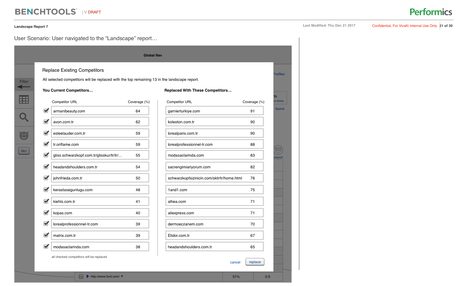
Option 1: Landscape Report Interactions
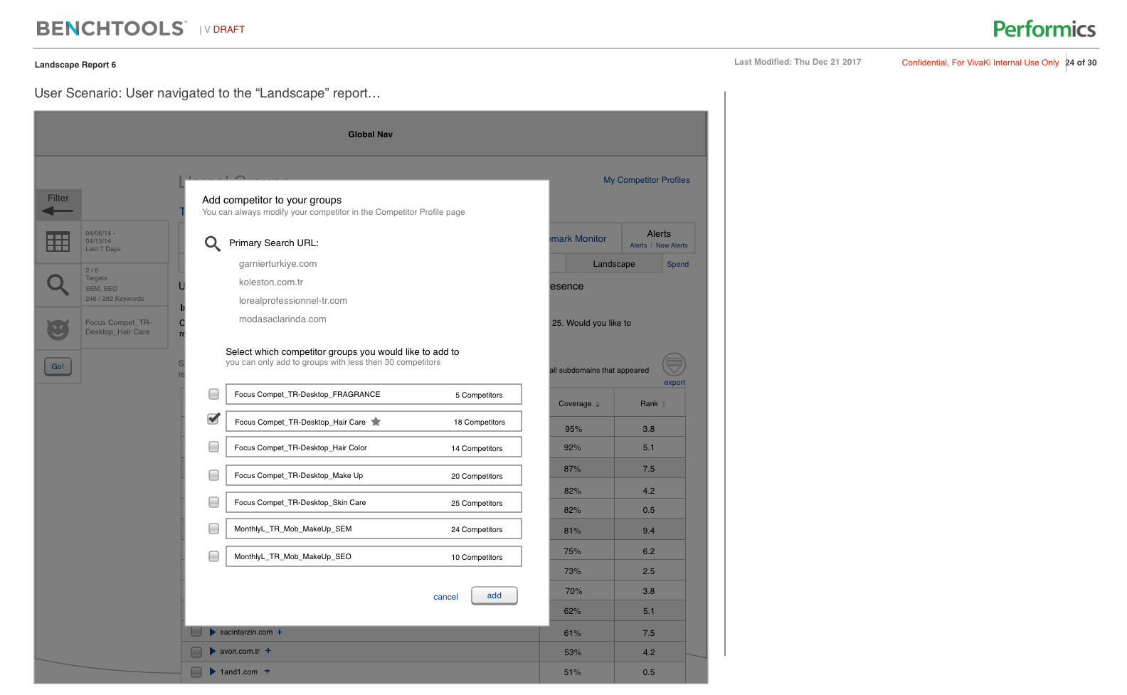
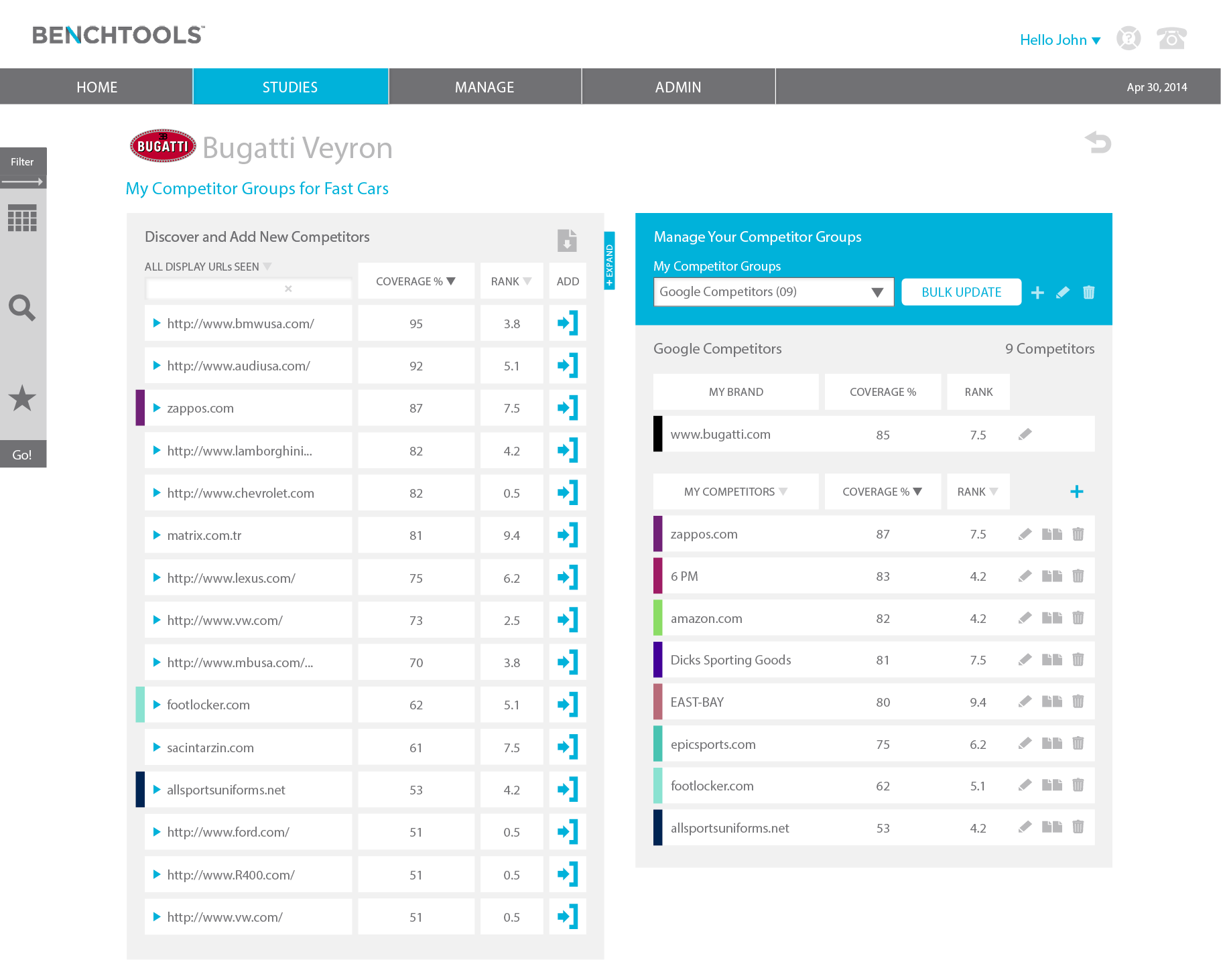
Option 2: Manage & Discover Competitors
User Experience Design and Deeper Insights:
After conducting user interviews, the clear winner was Option 2. To add a competitor to a group it took two clicks versus the four in Option 1. The other more complicated tasks took more clicks but less than Option 1. This was the ultimate factor for going with Option 2.
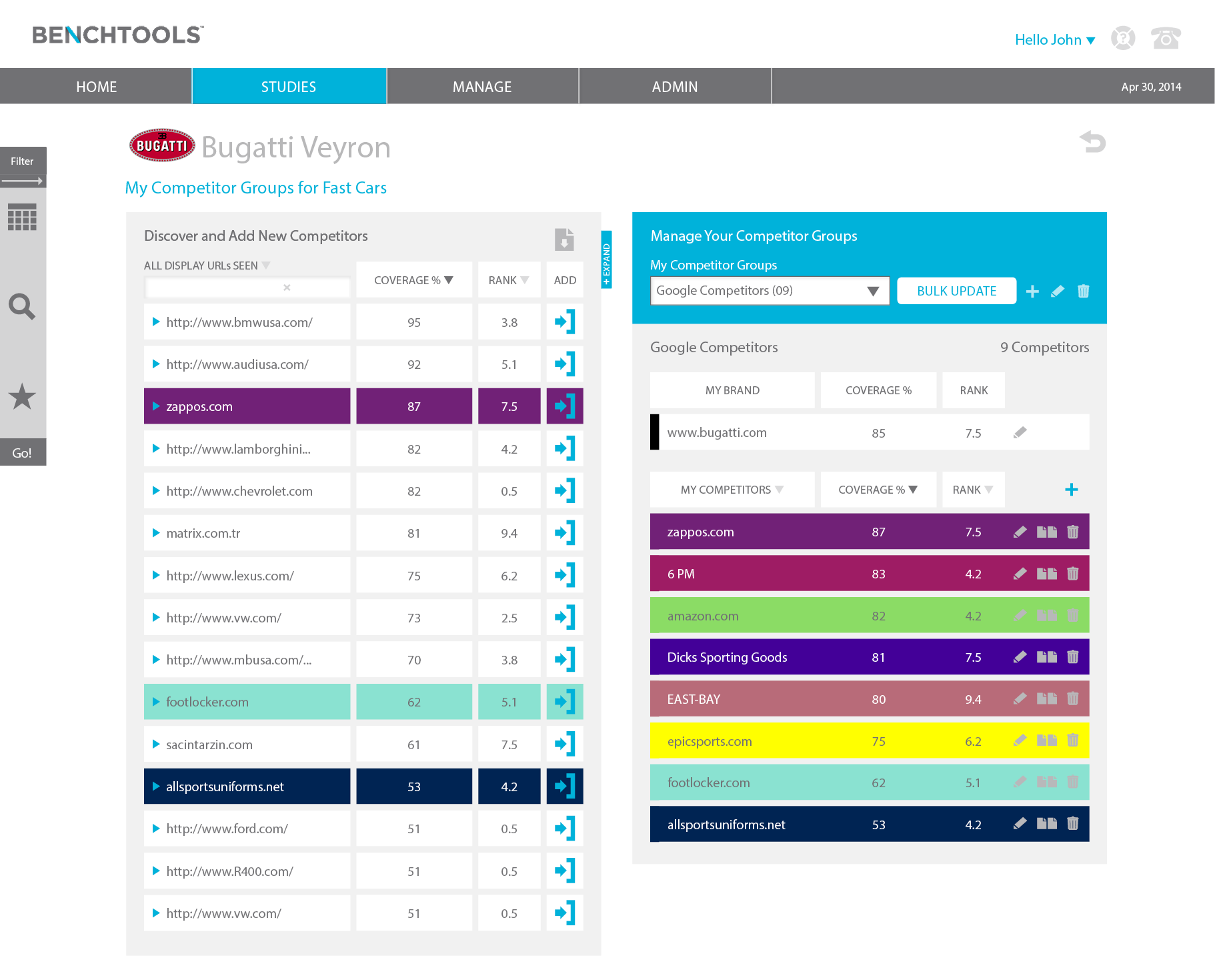
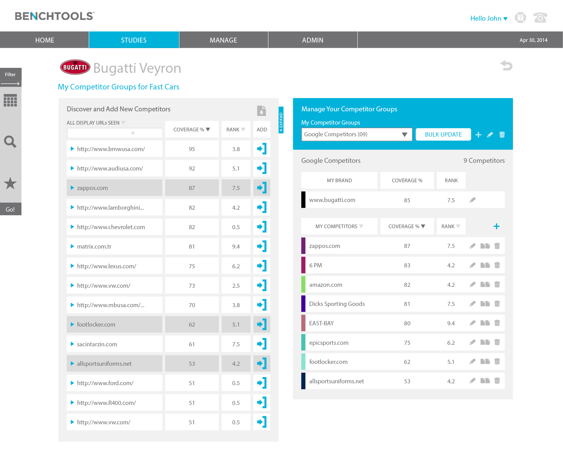
Visual Design and Deeper Insights:
Now that I established a user informed experience, we needed user feedback on the visual design. Our visual designer designed three options. I was bias, but asked for user feedback and to my surprise, my least favorite visual design was selected as the clear winner, Option B.
What I learned:
Even though the entire Product Team influenced the initial design, we got it wrong. Our goal was to release on time and due to time constraints, didn't solicit user feedback. This isn't necessarily a bad thing. I'm a strong believer in releasing fast, learning fast, and iterating.