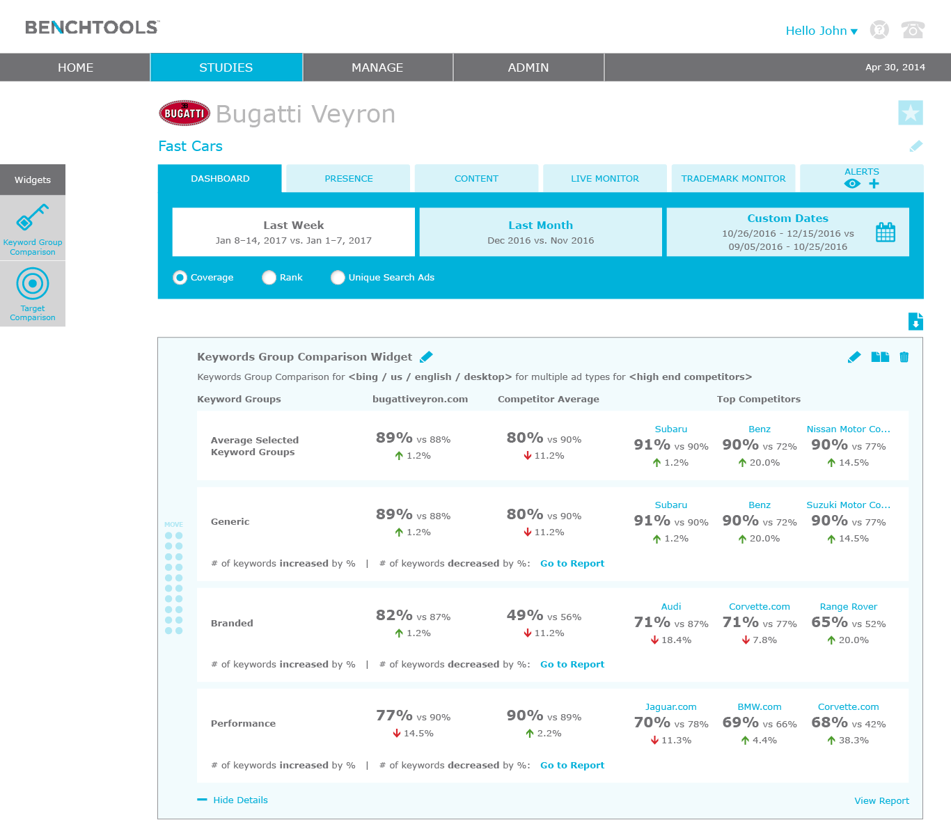
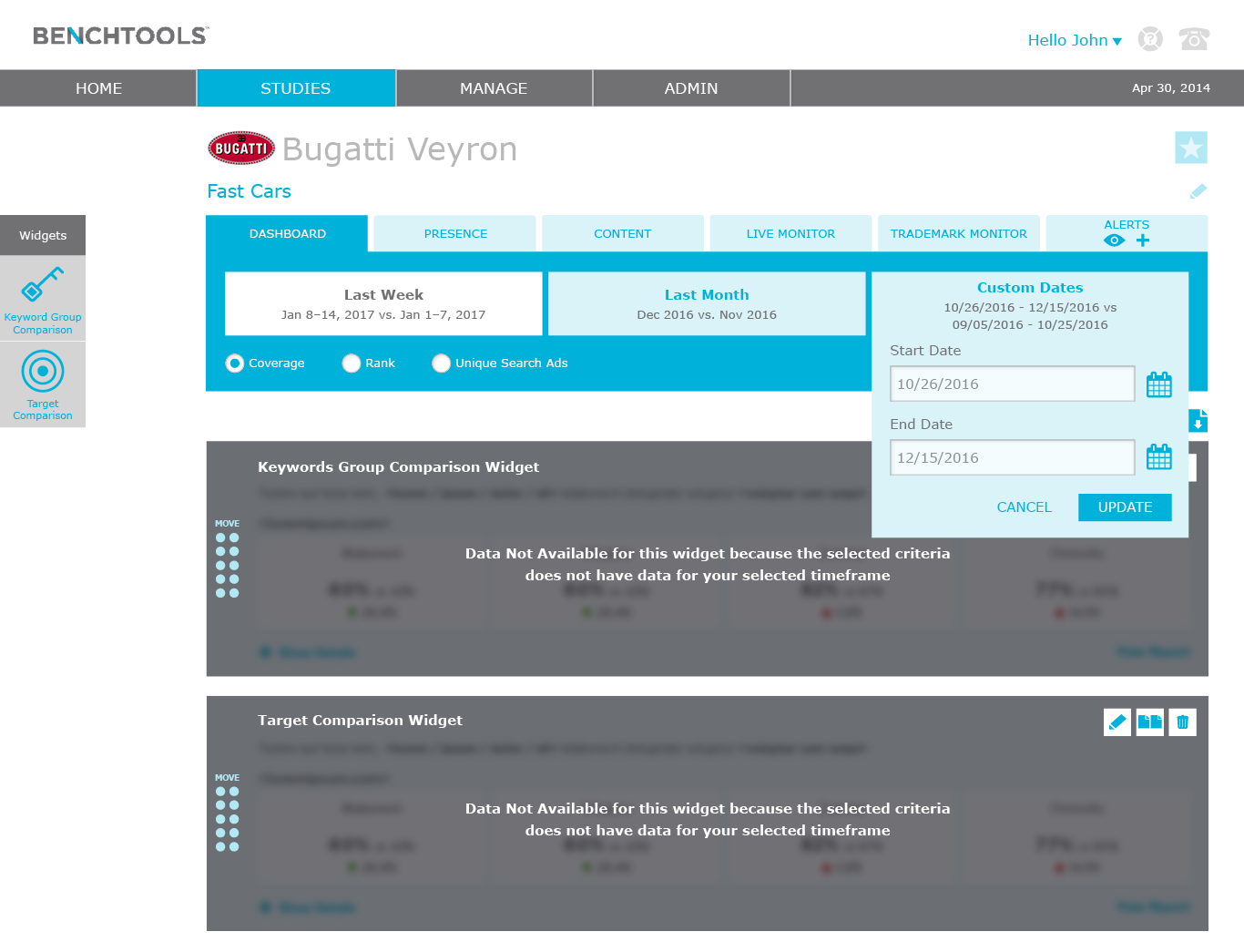
Project Overview:
The application is exploratory by nature. Meaning a user has to view a report and derive insights from it. The Dashboard initiative begins to make the application explanatory versus just exploratory. The Dashboard tells a story by comparing two different time frames with a set of KPIs and providing reasoning on the changes between the two time frames. The creative outputs reflect both user feedback and a team design sprint.
My Role:
For this project, I led both the user research and design of the dashboard. I conducted user research to better understand the problems. I also facilitated an internal workshop sketching solutions for the dashboard and gained insights of the proposed solutions by conducting low fidelity usability tests.
The Challenge:
To understand the problem, I conducted seven user interviews to identify the problems users are having with delivering actionable insights to their clients. I also gathered insights of their ideal solutions. The document below outlines the overall approach: the what, the why, and the how.
The Approach:
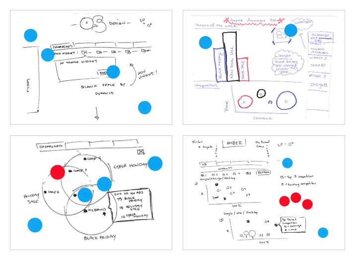
During a week-long summit with the entire global team (product, back end and front end devs, QA, and leadership), I facilitated a daylong workshop loosely following the Google Sprint Methodology. Based on the user feedback, I challenged the team to solve three different problems with three personas. However, each problem had to live within the same limitations of the other two problems. In other words, the dashboard had to be scaleable to solve for multiple use cases.
Team building design sprint was a one day process (over two days) for answering critical business questions through collaboration and design.
The entire team was broken out into two team member groups; based on their background and expertise, each sketched out solutions to the user problems. The sketches with the most team votes was the solution chosen to further explore.
Design:
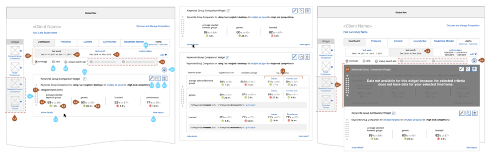
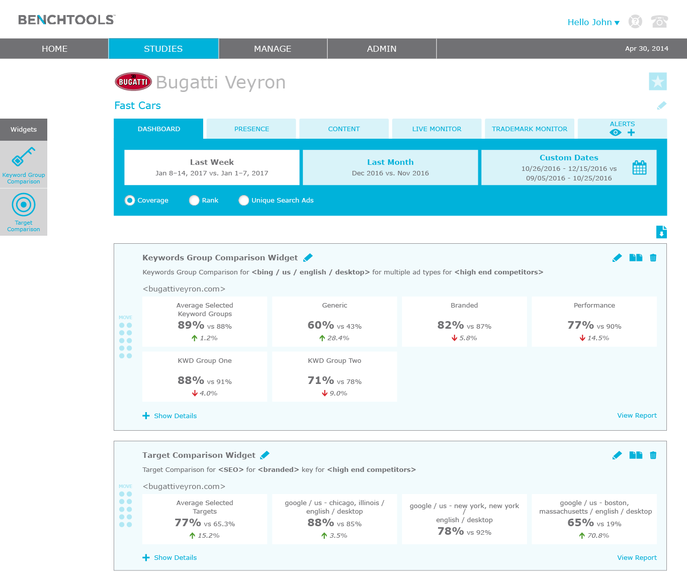
After the workshop, I designed the two solutions with the most votes and presented to the same seven users I interviewed to identify the problems. The user feedback was as expected, users liked some elements of Option A and some elements of Option B. In addition, gained useful insights of how to display the metrics that made the most sense. I married the two solutions and the wireframes and visual designs reflect the outputs.
What I learned:
We've all seen this before, after months of research and design, the project was descoped for higher priority features. I enjoyed acquiring qualitative and quantitative user and team feedback to inform the designs.
Throughout the project, our devs provided input on the overall technical feasibility and level of effort. Unfortunately, once visual design was completed, we realized the level of effort was not 100% correct and therefore had to revisit our technical approach. I should have been more diligent in asking the devs for their logic when providing technical feasibility and level of effort to catch this early on in the project lifecycle.