Project Overview:
We were tasked with designing “The 4G Experience” that included the personas, user flows, and the marketing site. The goal of this experience was to enhance Sprint’s 4G brand awareness for consumers and business users and to increase leads and sales on sprint.com.
My Role:
I authored all major UX deliverables: audited current content assets, designed the personas, designed the in-depth user flows, and designed the experience for Sprint's 4G marketing site.
The Challenge:
One of the biggest challenges I faced throughout this project was balancing moving forward with designs, while collaborating with the consumer and business teams. Since this project touched on both parts of the business, I needed to coordinate and get buy‐in from the two teams who often had conflicting priorities.
An internal team challenge was working with our new creative director after the initial experience was designed. Our new creative director had a different vision for the creative experience. Redesigning the experience, getting client sign-off, and working backwards from a fixed launch date created an intense environment.
The Approach:
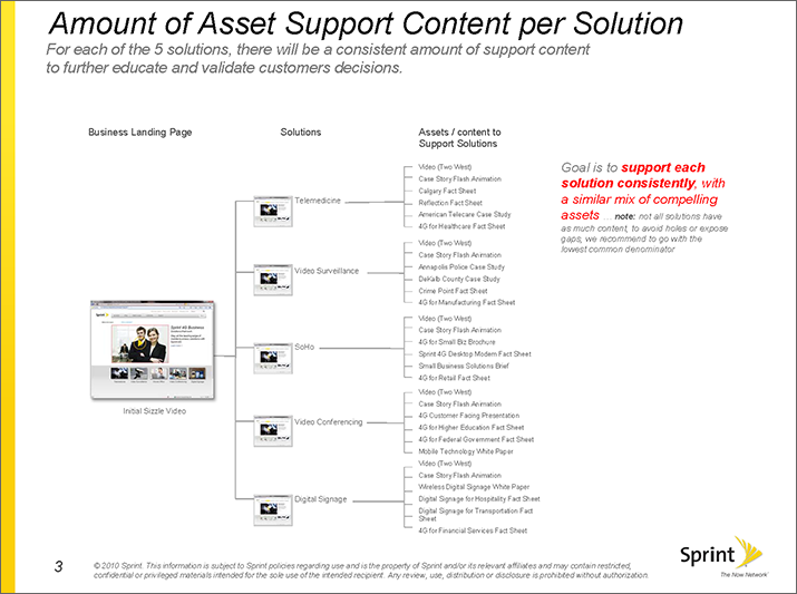
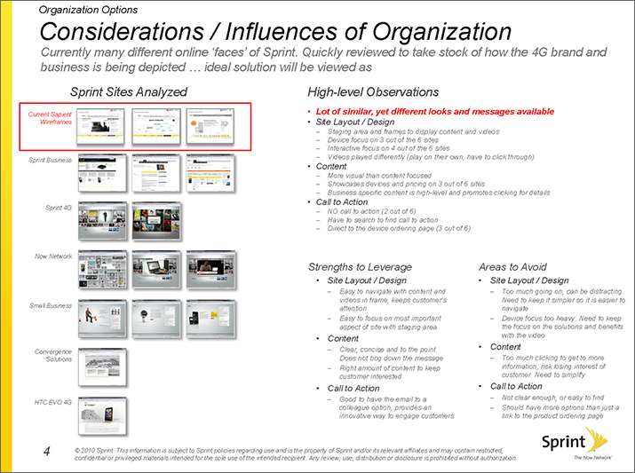
In preparation for the initial discovery presentation, the team conducted SME interviews to understand their business challenges. Together we identified risks, aligned on expectations and defined a shared vision for the experience. We conducted an audit of all available content for the marketing site and completed a competitive analysis. For this presentation, we included visual designs not only to excite the client but help them visualize our vision.
Design:
I researched and designed the personas. We used them constantly throughout the project to guide design decisions and priorities.
Our personas consisted of five different types: Techie & Professional, Budget-Conscious Families, Single & Stylish and Small and Large Business owner which we used to facilitate discussions about our users’ needs and varying contexts of entry points. The user journeys for each of the personas was the best way to conceptualize and structure the proposed content and entry points.
The additional research we conducted was looking into the client metrics to understand the multiple entry points users were accessing other micro sites and which entry points were successful. We quickly realized different personas shared the same entry points and vice versa. Once the entry points were established, we married the personas to the entry points to create an experience that was seamless and complete.
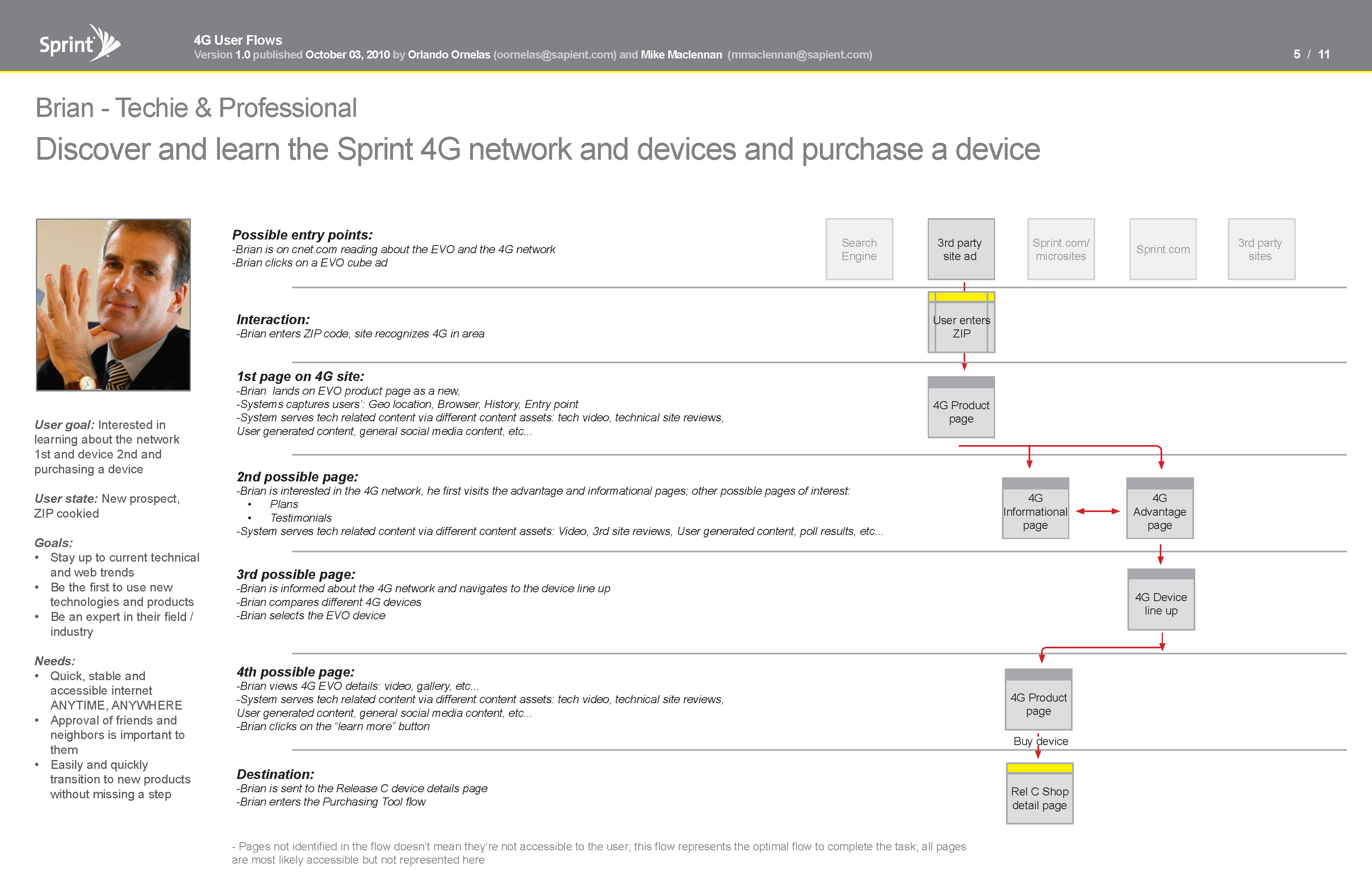
Persona: Techie & Professional. Entry Point: 3rd Party Site Ad
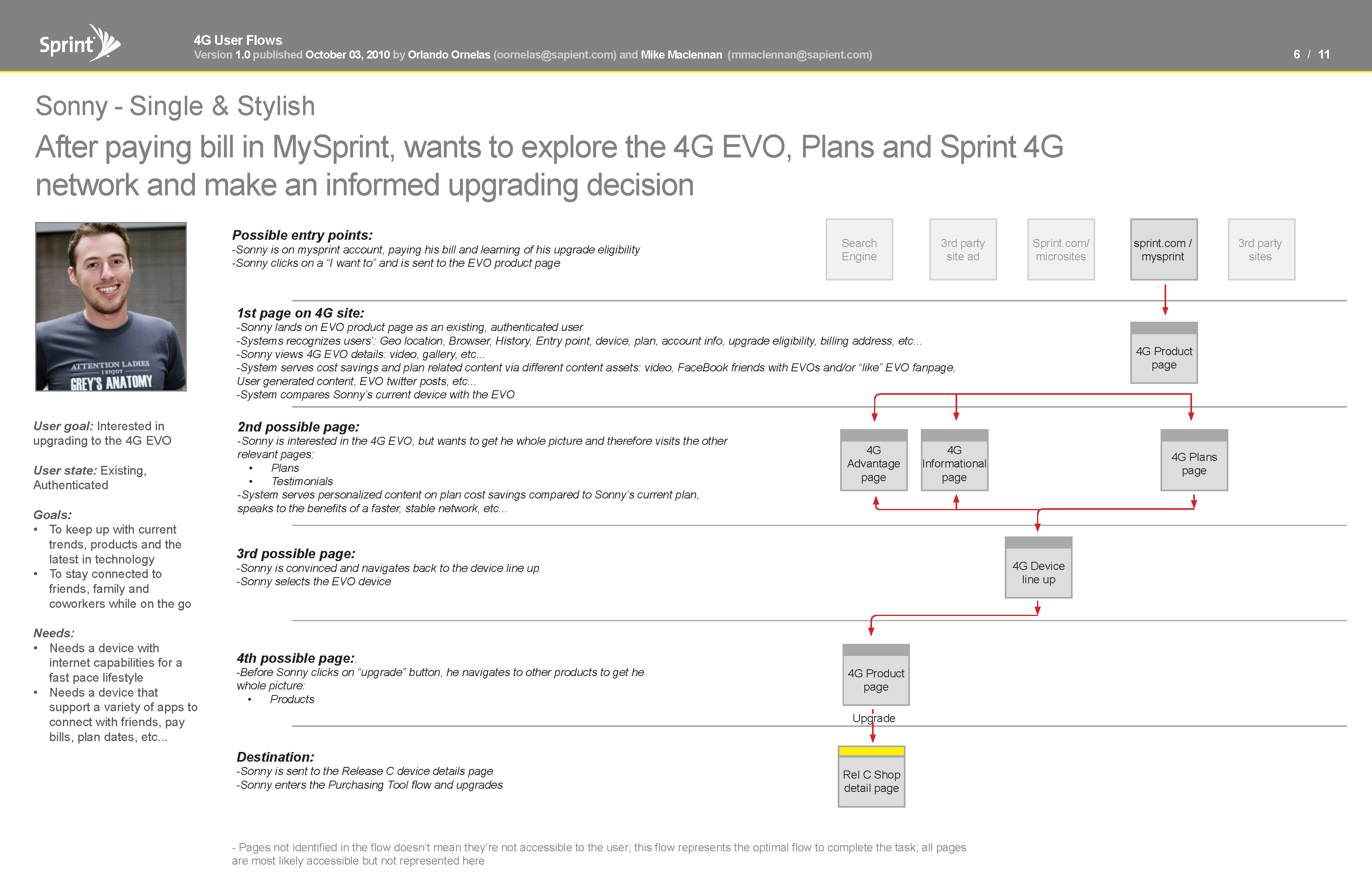
Persona: Single & Stylish. Entry Point: sprint.com's My Account Ad
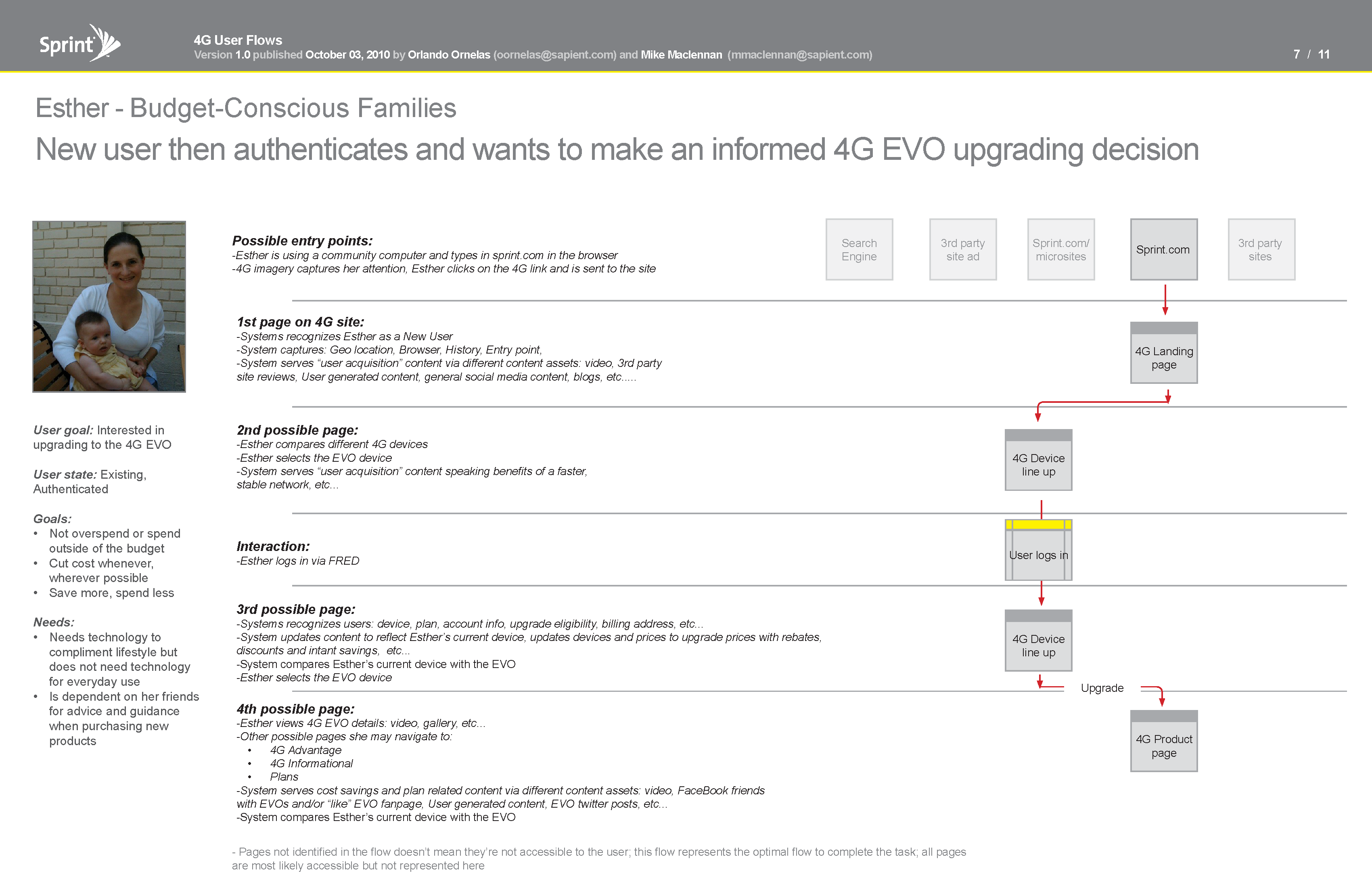
Persona: Budget Conscious Family. Entry Point: sprint.com
Download User FlowsThe Final Presentation:
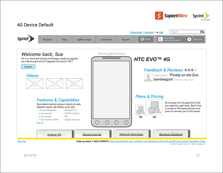
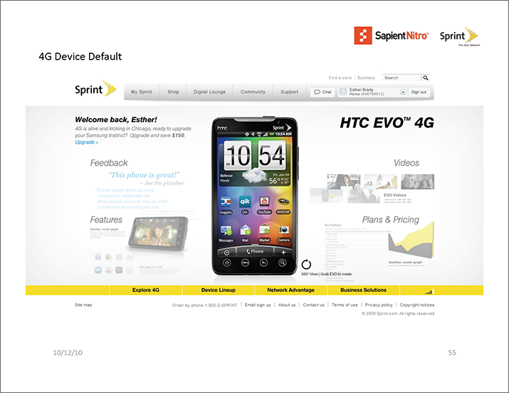
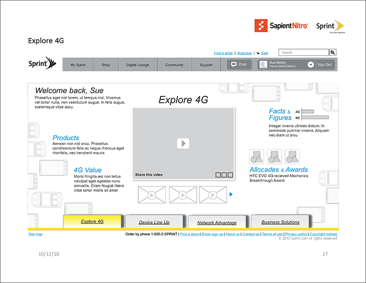
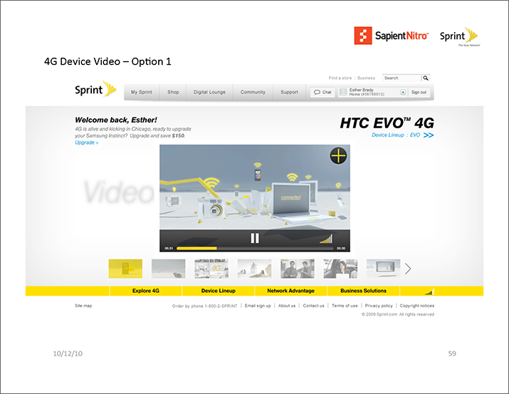
The presentation includes the site map, user flows, the wireframes for The 4G Experience marketing site and the visual comps for the consumer and business user.
What I learned:
Here is good example of breaking away from the standard to tell a better story. During the discovery phase, we used visual designs to get the client excited and help them visualize our vision. Typically, in this phase, we wouldn't use visual designs.
Regarding the user flows, my initial approach was to first present the personas followed by the user flows. But after internal feedback, I decided to include them in one document to better connect the dots between personas and their entry points. Overall, I learned sometimes it's more beneficial to "break tradition" and change things up to better engage the client.